I have seen this happen many times. A business spends a lot of money on marketing. Runs good ad campaigns but people still leave their website after just a few seconds. The problem is usually not the product or service it is the website design itself.
At TechVora Studios we have redesigned hundreds of websites for businesses. We see the mistakes over and over again. Here are the common mistakes I see and what you should do instead.
Not thinking about Mobile Experience
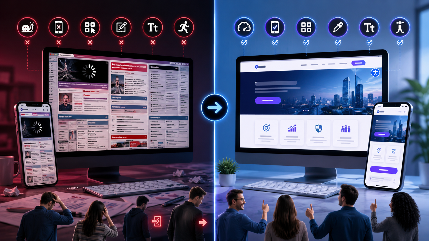
More than half of all website visits in the US come from phones. But I still see business websites where the buttonsre too small the text is too tiny and the whole layout falls apart on my iPhone.
Google notices this too. If your website is not easy to use on phones you will not show up well in local search results. To fix this you should test your website on mobile phones, not just on a computer. Make sure everything works well on phones.
Websites that take long to Load
People in America are not very patient. If your website takes than 3 seconds to load you will lose almost half of your visitors before they even see what you have to offer.
I remember one client whose website took than 8 seconds to load. After we fixed the problem the number of people who bought something from the website increased by 41% in the month. The problem is usually caused by pictures, too many plugins and code that is not efficient. You can fix this by making your pictures smaller using formats like WebP and choosing a good hosting service.
Navigation that is Hard to Use
When people cannot find what they are looking for on your website in than 5 seconds they will leave. This is a fact.
If your menus are hard to find your category names are not clear or your pages are not organized it will be hard for people to use your website. You should keep your navigation simple with no more than 5 to 7 clear items. You should also have a search bar that’s easy to see.
Navigation that is Hard to Use
You would be surprised how many business websites do not tell people what to do. There is no button that says “Get a Quote” or “Book a Call” or “Shop Now”.
Your visitors are not mind readers. You need to make it clear what you want them to do. Make your main button stand out with a color, clear words and put it in a place where people can see it.
Websites that Look Old
If your website looks like it was built a time ago it will make your business look small and unprofessional. Using pictures, old fonts and cluttering your pages with too much stuff will hurt your business.
In todays market your website is often the thing people see. A modern and clean design will make your business look good and trustworthy.
Websites that are Hard to Read
If you have blocks of text, small fonts and no space between sections it will be hard for people to read. You should use headings, short paragraphs, bullet points and plenty of space.
Forgetting about People with Disabilities
This is becoming very important. You need to make sure your website is accessible to everyone, including people with disabilities. This means using text for pictures making sure the colors are not too similar and making it easy to navigate with a keyboard. This will also help your website show up better in search results.
The Bottom Line
Your website is not a brochure, on the internet it is a salesperson that works for your business 24 hours a day. If your website has design mistakes it can lose you money hurt your reputation and stop you from growing.
If you are not sure if your website is helping or hurting you getting a perspective can make a big difference. At TechVora Studios we specialize in making websites that actually work for American businesses.
Are you tired of losing customers because of your website?
Lets talk. You can send us a message. We will look at your website for free.